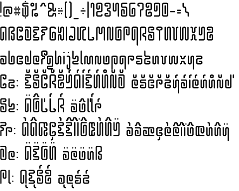
Hieroglyphos
Back to the list of fonts
  Because my Hieroglyphic font is hardly readable I decided to correct it and this is the result. It's still hardly readable but with a twist. ;) Version history 0.930 2014-05-28+ comma+... apostrophe * modified: jcircumflex 0.929 2014-05-27 + macron+... Tt-comma HhTt-bar approx notequal * modified: 3 0.928 2014-05-26 + breve+... section perthousand integral * modified: quotes 0.927 2014-05-25 + &/\ circumflex+... guillemots 0.926 2014-02-06 * modified shape: JOvXZ frstvxz + AaEe-ogonek, Yy-circumflex, Ĺ弾ŤŮ + Zdotaccent, Cc-dot, OoUu-hungarumlaut 0.925 2014-02-02 * increased margins +25 * modified shape: 23589 BCEFHLMNRT jku * decreased height of all glyphs -100 0.922 2014-02-01 + circumflex+... * modified: !?HXijx 0.921 2014-01-31 + dieresis+... * fixed spacing 50-50 * fixed directions etc. 0.92 2003-08-17 + a-uacute 0.91 0.90 2001-03-21 + a-z |
0.930 (2014-05-28) 2005-2014 En Cz Sk De Pl Fr |
© Vít Čondák / Gunny 2000-2024