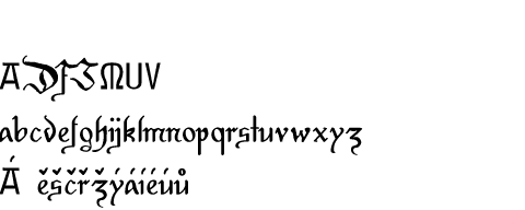
Mikoláš Fracture
Back to the list of fonts
  One of the favourite books of my childhood was collection of drawings by Mikoláš Aleš (1852 - 1913) "Mládeži" (For the Youth) because it included a lot of horses, soldiers and knights. As I grew up, I lost interest in such themes, but somewhere in 2001 it occured to me that I could create a font based on Aleš's fractured letters. Unfortunately it didn't take long to find out that it's not that easy. Aleš's style evolved a lot during his lifetime and he also varied letters to fit the theme of the picture. Sometimes he even used two completely different shapes of the same letter in one word so choosing one ideal shape is rather difficult. Because all these complication I lost my enthusiasm and the develompent of this font has stuck. Right now it includes at least working versions of all small letters. At least it led me to creating Mikoláš Script 1900 that seems to be slightly more developed and usable. Version history 0.13 2014-05-17* M * modified metrics: a 0.12 2014-05-15 * DJM akz 0.11 2014-01-23 * 0.09 2014-01-22 + temporary: M * many tweaking of small letters 0.08 2014-01-20 * round serifs * many tweaking of small letters 0.04 2014-01-16 * fixed metrics * unified: klh 0.02 2014-01-15 * unifying sizes and clenup 0.01 2012-11-30 - start from scratch + rought import: abcdehijklmnopqrstuvwxyz 0.009 2001-11-04 + akmorstvyz |
0.13 (2014-05-17) En Cz |
© Vít Čondák / Gunny 2000-2024